Communicating science on social media requires more than simply sharing information. It involves translating complex ideas into visually engaging, accessible content tailored to specific audiences. This portfolio showcases two Instagram posts developed for CSIRO and The Conversation, demonstrating how strategic design and messaging can be used to communicate scientific concepts in ways that are both informative and engaging.
CSIRO: The Science Behind Mardi Gras
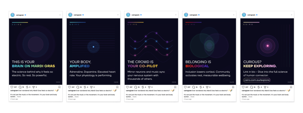
CAPTION: Ever wondered why Mardi Gras feels so electric? ⚡🌈 It’s not just the music or the movement — it’s your brain and body working together. From adrenaline-fuelled energy to the powerful effects of connection, science is behind every moment. When people feel seen, safe and included, it doesn’t just feel good — it supports real wellbeing. 👉 Curious to learn more? Explore the science behind Mardi Gras via the link in bio. #CSIRO #ScienceExplained #MardiGras #STEM #Neuroscience #InclusionInSTEM #AusScience
ALT TEXT: Carousel explaining the science behind the emotional and physical experience of Mardi Gras, including brain activity, body responses, and the impact of social connection, presented in a modern, abstract design.
REFLECTION
This carousel was designed to align with CSIRO’s established visual identity, which emphasises innovation, clarity and scientific credibility. The use of a dark colour palette combined with subtle gradient accents reflects a modern and technological aesthetic, helping position the content within a STEM-focused context. Abstract visual elements, such as circular patterns and flowing gradients, were used to represent concepts like brain activity and energy without relying on literal imagery. This approach reinforces the scientific theme while maintaining a visually engaging style suited to Instagram.
The key message focuses on explaining why Mardi Gras feels powerful through the lens of science, highlighting physiological responses, brain activity and the impact of social connection. This was intentionally selected to resonate with the target audience of young urban Australians aged 18 to 30, who are likely to value both cultural events and scientific insights. By linking a widely recognised event to scientific concepts, the post makes complex ideas more relatable and relevant to everyday experiences.
The carousel format was chosen to support progressive storytelling, beginning with a strong hook and moving through simplified explanations before concluding with a call to action. This structure encourages users to engage by swiping through the content, which aligns with platform-specific behaviours and increases retention. Each slide presents concise, digestible information, ensuring that the content remains accessible and appropriate for social media consumption.
The tone of the content balances engagement with credibility by avoiding overly technical language while still communicating accurate scientific ideas. This reflects best practice in science communication, where simplifying information without losing meaning is critical for audience understanding. According to Brossard (2013), effective science communication in digital environments depends on making content both accessible and relevant to non-specialist audiences.
Overall, the design demonstrates how visual storytelling, audience awareness and platform-specific strategies can be combined to communicate scientific concepts in a way that is both engaging and informative.
The Conversation: Understanding Lightning
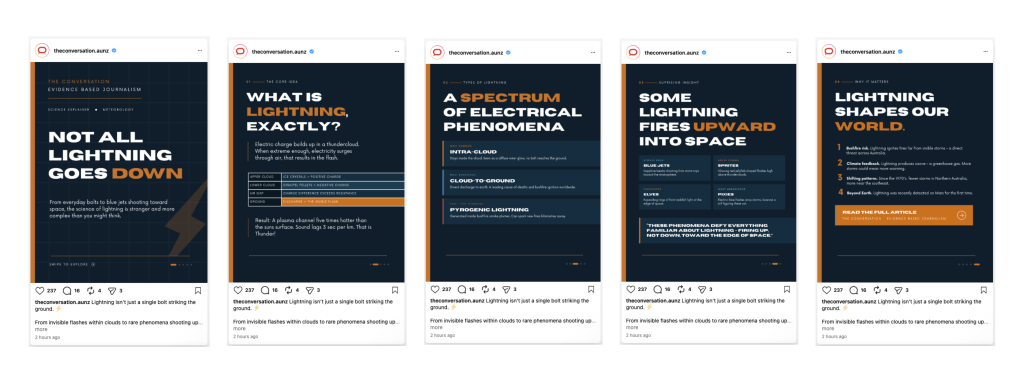
CAPTION: Lightning isn’t just a single bolt striking the ground. ⚡ From invisible flashes within clouds to rare phenomena shooting upward into space, lightning exists across a complex spectrum of electrical activity. Understanding how it works helps scientists better predict weather, assess bushfire risk, and study changes in our climate. 👉 Read the full article via the link in bio. #TheConversation #ScienceExplained #Lightning #Meteorology #ClimateScience #EvidenceBased
ALT TEXT: Infographic explaining the different types and behaviours of lightning, including intra-cloud, cloud-to-ground and rare upward phenomena like blue jets and sprites, presented in a clean editorial style.
REFLECTION
This infographic was designed to align with The Conversation’s editorial and academic visual identity, which prioritises clarity, credibility and evidence-based communication. Unlike the more visually dynamic approach used in the CSIRO carousel, this design adopts a clean, structured layout with a muted colour palette and strong typographic hierarchy. The use of a dark blue background with subtle grid elements reflects a professional, data-driven aesthetic, reinforcing the organisation’s focus on research-led journalism.
The key message centres on explaining that lightning is more complex than commonly understood, highlighting different types of lightning and their broader scientific significance. This approach was chosen to engage the target audience of Australian adults aged 35 to 45, who are more likely to value detailed, informative content that provides deeper insight into scientific topics. By distilling the article into a series of concise, structured sections, the infographic presents complex meteorological information in a way that remains accessible while maintaining intellectual depth.
The infographic format allows multiple related ideas to be presented within a single visual frame, supporting a more comprehensive overview compared to the carousel format used in Brief 1. Information is organised into clearly defined sections, including key concepts, types of lightning, surprising insights and broader implications. This structured approach aligns with the expectations of an audience that prefers clarity and logical progression in information delivery.
The tone is intentionally more formal and informative, reflecting The Conversation’s role as a source of evidence-based journalism. Technical concepts are simplified where possible, but key terminology is retained to preserve accuracy and credibility. This balance between accessibility and precision is essential in science communication, particularly for audiences seeking reliable and well-supported information. As Brossard (2013) notes, effective science communication involves adapting complexity to suit audience needs while maintaining trust and authority.
Overall, the design demonstrates how visual communication strategies can be adapted to suit different audiences and organisational contexts, highlighting the importance of aligning design, tone and structure with both brand identity and audience expectations.
CONCLUSION
These projects demonstrate how scientific content can be adapted across different platforms and audiences through strategic design and communication choices. By aligning visual style, tone and messaging with each client’s brand identity, both posts aim to make complex ideas more engaging, accessible and impactful. For organisations looking to communicate science effectively in digital spaces, thoughtful design and audience awareness are key to creating meaningful engagement.
REFERENCES
Brief 1 (CSIRO):
Dawkins, R. (2026, February 24). The science of Mardi Gras. CSIRO. https://www.csiro.au/en/news/All/Articles/2026/February/science-of-mardi-gras
Brief 2 (The Conversation):
Dowdy, A., Catto, J., & Schofield, R. (2026, January 13). From bolts to blue jets, lightning comes in many strange forms. The Conversation. https://theconversation.com/from-bolts-to-blue-jets-lightning-comes-in-many-strange-forms-268197

Leave a comment