About Gabe

A minimal portfolio for thoughtful brands that prefer clarity over noise and trend chasing.

A pristine, ultra-thin silver laptop open on a pale concrete desk, its high-resolution screen displaying a minimalist black-and-white geometric poster design with ample negative space. Beside it rests a single square color swatch card in muted beige, positioned deliberately to echo the on-screen composition. The background fades into a soft blur of light grey wall, completely bare. Cool, even studio lighting creates subtle reflections on the metal surface and crisp shadows along edges. Photographic realism, eye-level composition with rule-of-thirds framing, conveying a clean, modern graphic design studio. The atmosphere feels quiet, intentional, and highly curated, communicating a sophisticated portfolio environment.
A meticulously arranged flat lay of restrained branding elements on a warm grey background: one uncoated business card in off-white with tiny black sans-serif type, a small square logo mark card in deep charcoal, and a thin metal ruler aligned precisely. Negative space dominates the composition, with each object spaced evenly. Overhead softbox lighting creates a gentle, shadowless environment that highlights subtle paper textures and the contrast between matte and metallic surfaces. Photographic realism, bird’s-eye view, with asymmetrical balance leaning toward the lower right corner. The mood is refined and deliberate, suggesting a graphic designer’s curated identity system that celebrates simplicity and precision.

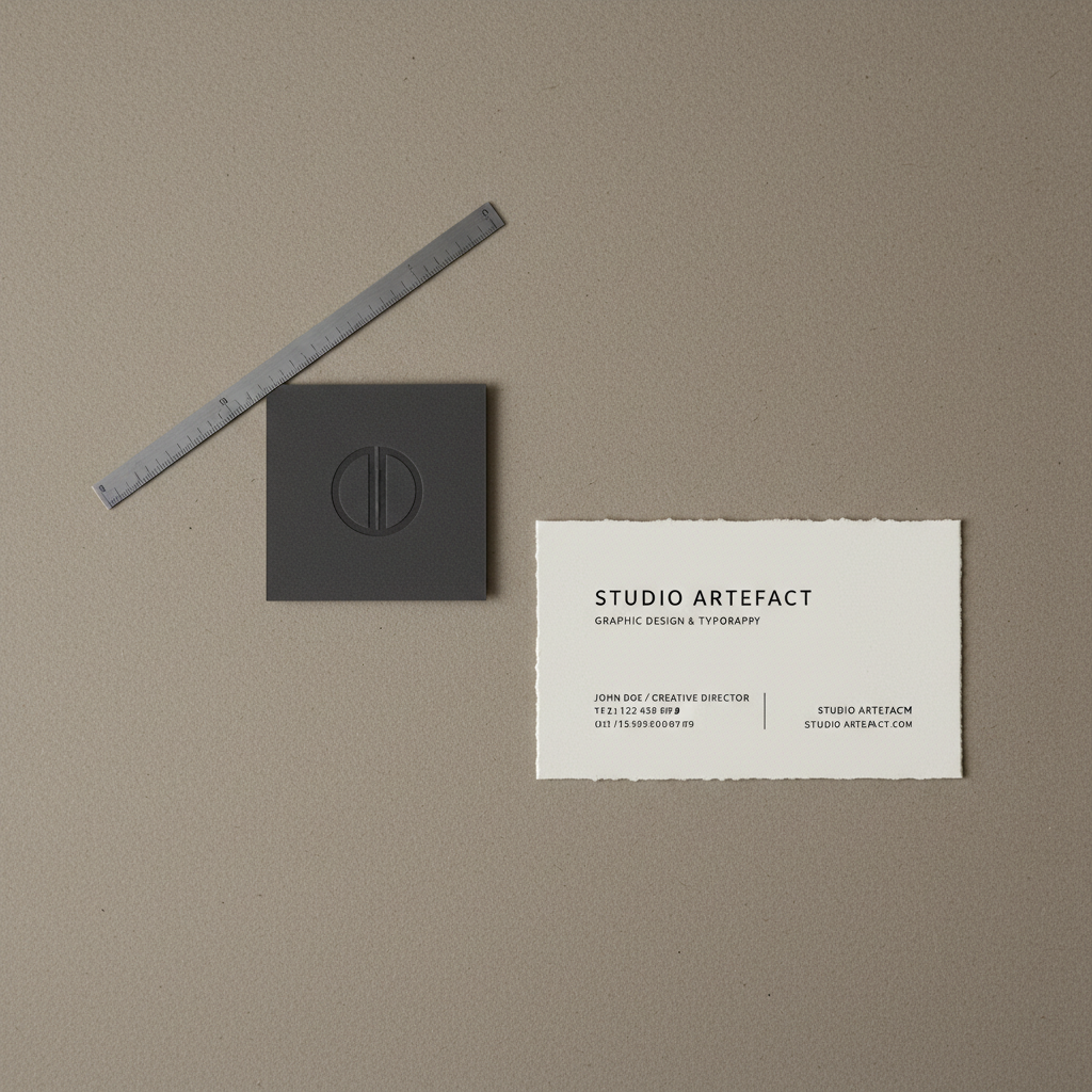
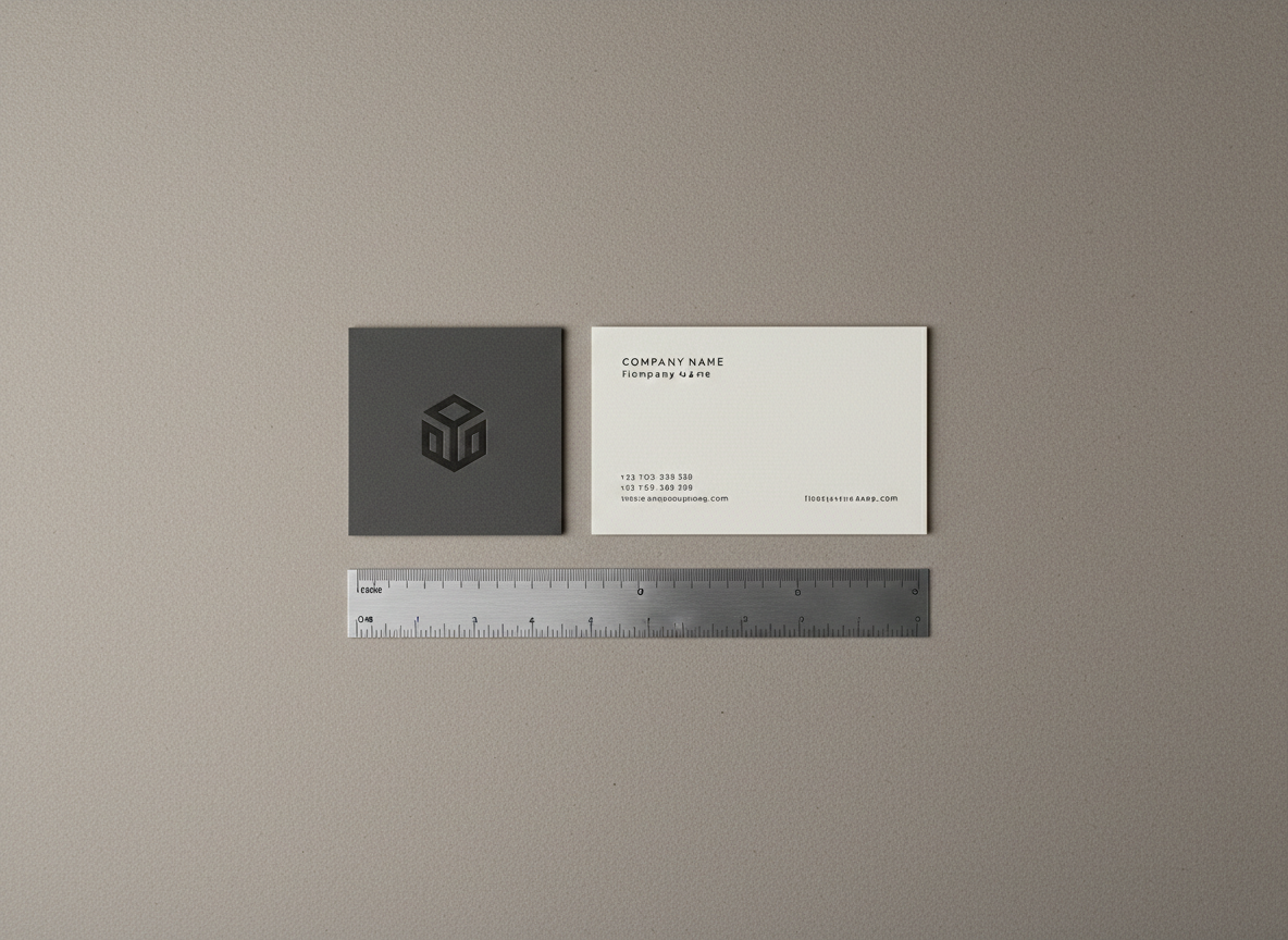
Graphic design, distilled to essentials

I’m Gabe, a graphic designer focused on clear, quiet visuals. I draw from modernism, print culture, and everyday objects to strip ideas down to what matters, shaping brands that speak softly and stay memorable.

About

How we shape your visuals

We begin with a short conversation, then sketches and digital explorations in Figma and Adobe. Feedback happens in focused rounds, keeping files tidy, timelines clear, and every decision intentional, so the final design feels effortless.

A meticulously arranged flat lay of restrained branding elements on a warm grey background: one uncoated business card in off-white with tiny black sans-serif type, a small square logo mark card in deep charcoal, and a thin metal ruler aligned precisely. Negative space dominates the composition, with each object spaced evenly. Overhead softbox lighting creates a gentle, shadowless environment that highlights subtle paper textures and the contrast between matte and metallic surfaces. Photographic realism, bird’s-eye view, with asymmetrical balance leaning toward the lower right corner. The mood is refined and deliberate, suggesting a graphic designer’s curated identity system that celebrates simplicity and precision.